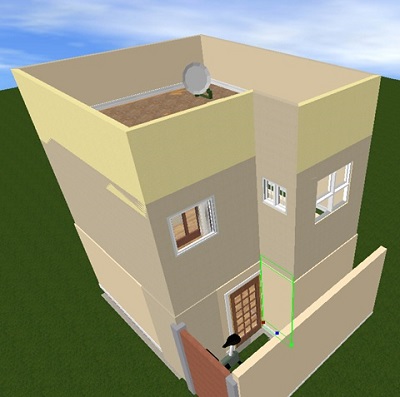
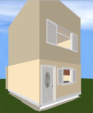
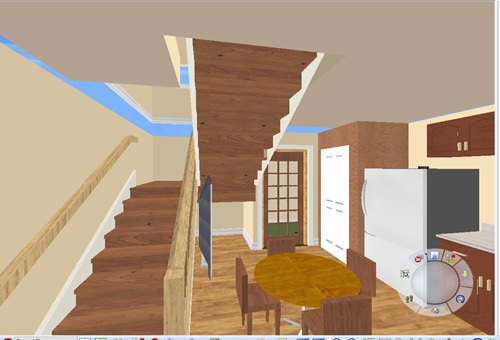
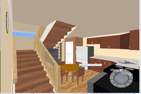
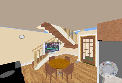
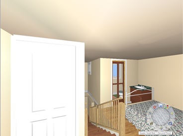
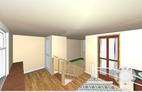
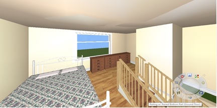
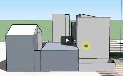
We wanted to share the impact even an small bit of open space has on the inside of a tiny home. The original developer proposal only had windows in the front because they wanted 100% coverage. Such a design in our opinion and our experience in one of own rooms, creates a cave effect and the circulation inside the house is so difficult to create. By just adding a small piece of open space to the design creates so much light and openness inside the house also.
Articles from August 2017
3D Rendering of Impacts on Light without Open Space
I’m so surprised that the Philly ZBA does not require this for all new developments. It was so easy to create. The new tech is awesome. We created a few 3D renderings of the developer’s proposed design of a 3 floor building without open space and then two designs with a small L-shape open space in a 3 floor and then a 2 floor design. We used www.SketchUp.com a free product for 30 days that also allows you to drop the rendering into Google Earth to get the appropriate shadows through out the year. Then we used Flashbackrecorder to record the rotating and changing of time through the year.
The first video is of the 3 story version proposed by the developer. Notice the size in comparison to the house on Manton Street and the garage behind. The recording and shadows are based on August 30th at about 10:52am for an accurate comparison.
The next video is the 2 story Tiny house that is more appropriate for older residents and people that just want a ting house with a little open space to store trash, bicycles, barbecue or enjoy our giant tree. Look at the sight lines in the back of the houses. Just a little bit of open space just 2 to 3 ft just changes everything.
The next video is a capture of the shadow changes for the 3 story no open space design. What I did was start early in the year and then vary the hours in the day. After I cycled through the day I then would pick another day a month or two later and cycle through the hours of the day. I repeated this throughout a standard year. This is important because the Sun’s angle changes throughout the year and you have to look at more than one day for a good comparison.
Then the same 3 story concept with the small L-Shape open space. The sight lines and openness really is present even with just a small bit of open space and variation from a plain vanilla box design.
Now here is the same L-shape open space but in a 2 story design. It is so much better than the 3 story design. Plus because of building codes for PA, US and international the house can never be more than a one bedroom. Who wants to travel up 3 flights of stairs to go to the bathroom?
Lastly we create a comparison video of all three designs at the same day and time August 30th at 10:52am.

